
Basset Hound Rescue of Southern California
Basset Hound Rescue of Southern California is a all volunteer nonprofit that has been offering sanctuary, healing, and forever families to distressed, abandoned, and homeless basset hounds since 1998. With 2,291 hounds adopted and 80+ active volunteers, BHRSC has a meaningful mission, but their digital presence wasn't keeping up. I was brought on to help assist the webmaster with website udpates. I then steped up to lead the redesign of their website, collaborating with the webmaster and key stakeholders to modernize the site, reduce technical debt, and ultimately drive more adoptions, donations, and volunteer sign-ups.
Problem Statement
After more than a decade without a significant refresh, the BHRSC website had accumulated serious technical debt and UX issues that was actively hurting the organization.
Technical Issues:
- Multiple critical plugins no longer compatible with modern updates, creating security vulnerabilities.
- No automated image optimization, resulting in slow load times.
UX Issues:
- An oversaturated navigation with redundant links created decision paralysis for users.
- Primary calls to action (Adopt, Donate, and Shop) were buried under excessive text.
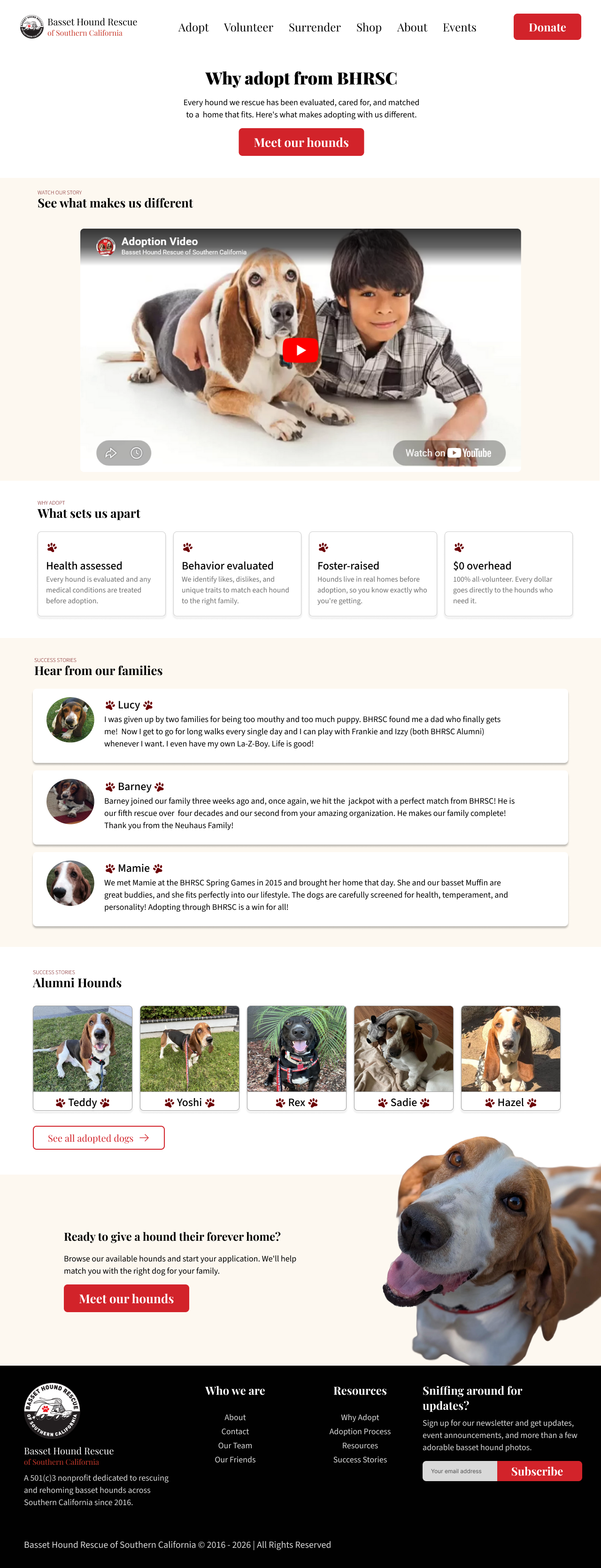
- The homepage led with a raw adoption count stat rather than an emotional hook, missing an opportunity to connect with first-time visitors.
Goals
The redesign had two core objectives:
- Sustainability — migrate to a platform that reduces technical maintenance and empowers non-technical team members to make their own updates.
- Conversion — increase the number of adoptions, donations, and shop purchases by surfacing the right actions at the right moments.
My Role
As the lead designer on this project, I was responsible for:
- Help conduct a full audit of the existing site and identifying problem areas.
- Help with writing the redesign proposal.
- Designing all mockups in Figma.
- Restructuring the site's information architecture and navigation.
- Managing WordPress product listings and the WooCommerce online shop
- Supporting in-person events and on-site merchandise sale.
Design Process
Discovery & Audit
I began by conducting a full audit of the existing website, documenting more than 30 pages across 8 sections. Working closely with stakeholders, I identified pages that could be removed, merged, or restructured to simplify the overall experience.
Competitive Research
To identify opportunities for improvement, I analyzed several rescue and nonprofit websites. I found that the strongest experiences highlighted adoptable animals early, used clear donation pathways, and relied on emotional storytelling to quickly build trust with potential adopters and volunteers.
Information Architecture
One of the most impactful changes was restructuring the site's navigation. The original menu contained overlapping content and too many options, creating unnecessary friction. I consolidated redundant sections, reduced the number of navigation items, and elevated Donate as a primary call-to-action.
Before & After
The redesign touched nearly every part of the site, but a few changes had the biggest impact on usability and conversion.
| Area | Before | After |
|---|---|---|
| Hero | Statistics first such as 2,291 hounds adopted to build truse | Emotional tagline with clear CTAs |
| Navigation | 7+ top-level items, redundant links | 6 streamlined items, Donate elevated |
| Adoptable Dogs | Separate page, no homepage presence | Featured on homepage with personality cards |
| Resources | Scattered across multiple nav sections | Unified single page with sticky in-page nav |
| Volunteer/Foster | Two separate sections | Merged into one cohesive flow |
| Events | Standalone News & Events page | Featured on homepage |
Key Structural Changes
- Merged all resource pages into a single scrollable Resources page with an in-page sticky nav.
- Combined Volunteer and Foster sections into one unified flow.
- Moved Events onto the Homepage to increase visibility.
- Merged "Pawtomatic Friends" and "Our Friends" into one page.
- Proposed renaming "Adopted" to "Alumni Hounds" and merging with Forever Fosters.
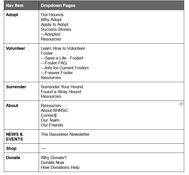
Curent navigation structure
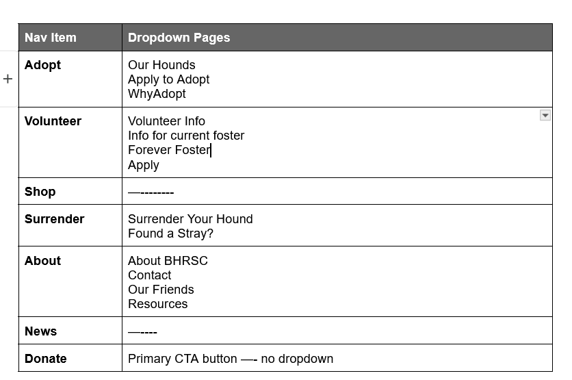
Proposed nav structure
Next Steps
The project is currently in progress. Upcoming milestones include:
- Creating the final figma document for development handoff.
- Preseting it to stakeholders and to the board.
- Finalizing the Wix migration with the webmaster.
- Implementing and testing all forms (adoption, volunteer, surrender).
- Ongoing iteration based on stakeholder and user feedback
Gallery
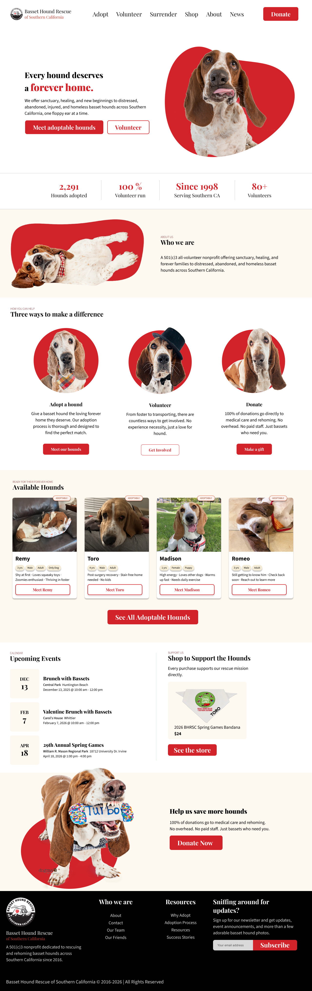
BHRSC HomePage
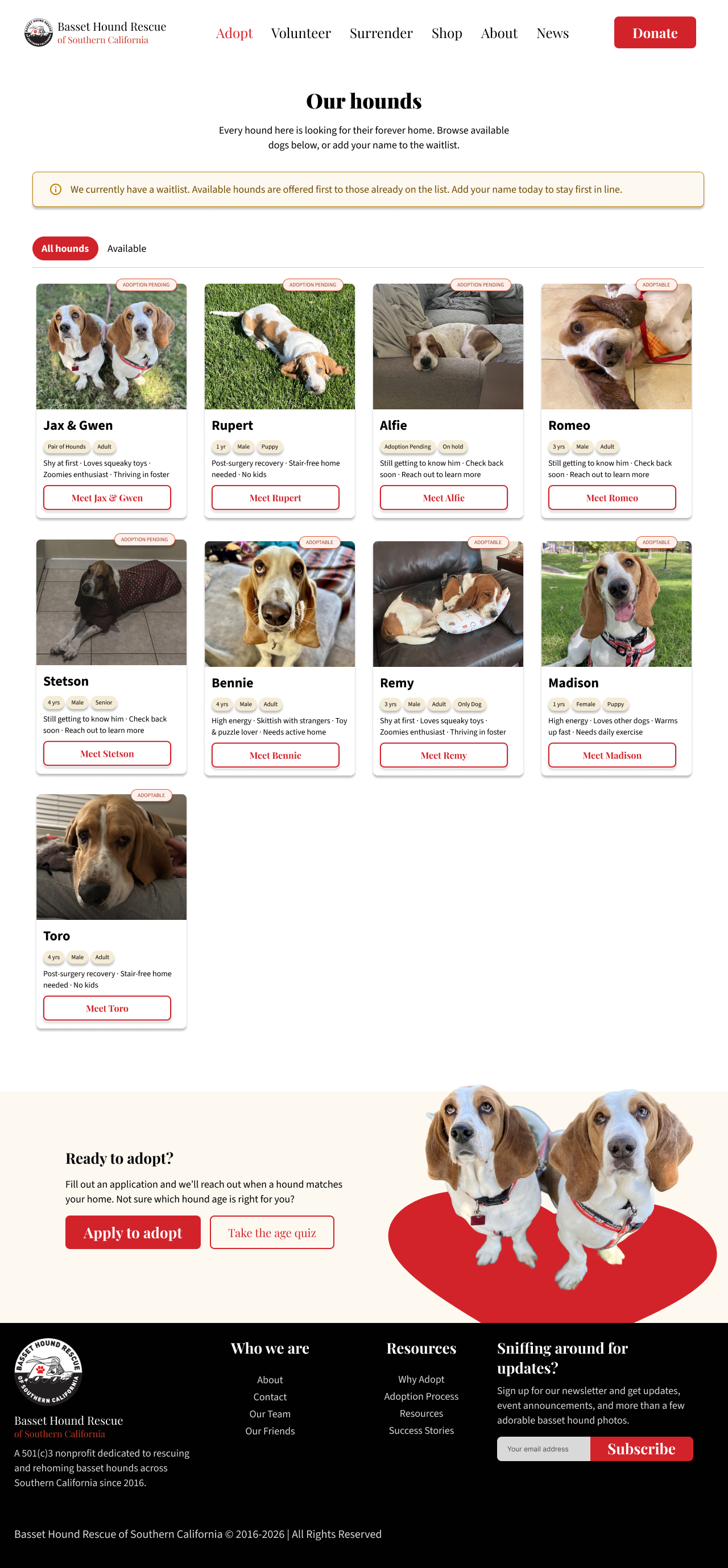
BHRSC Adoption
BHRSC Why Adopt
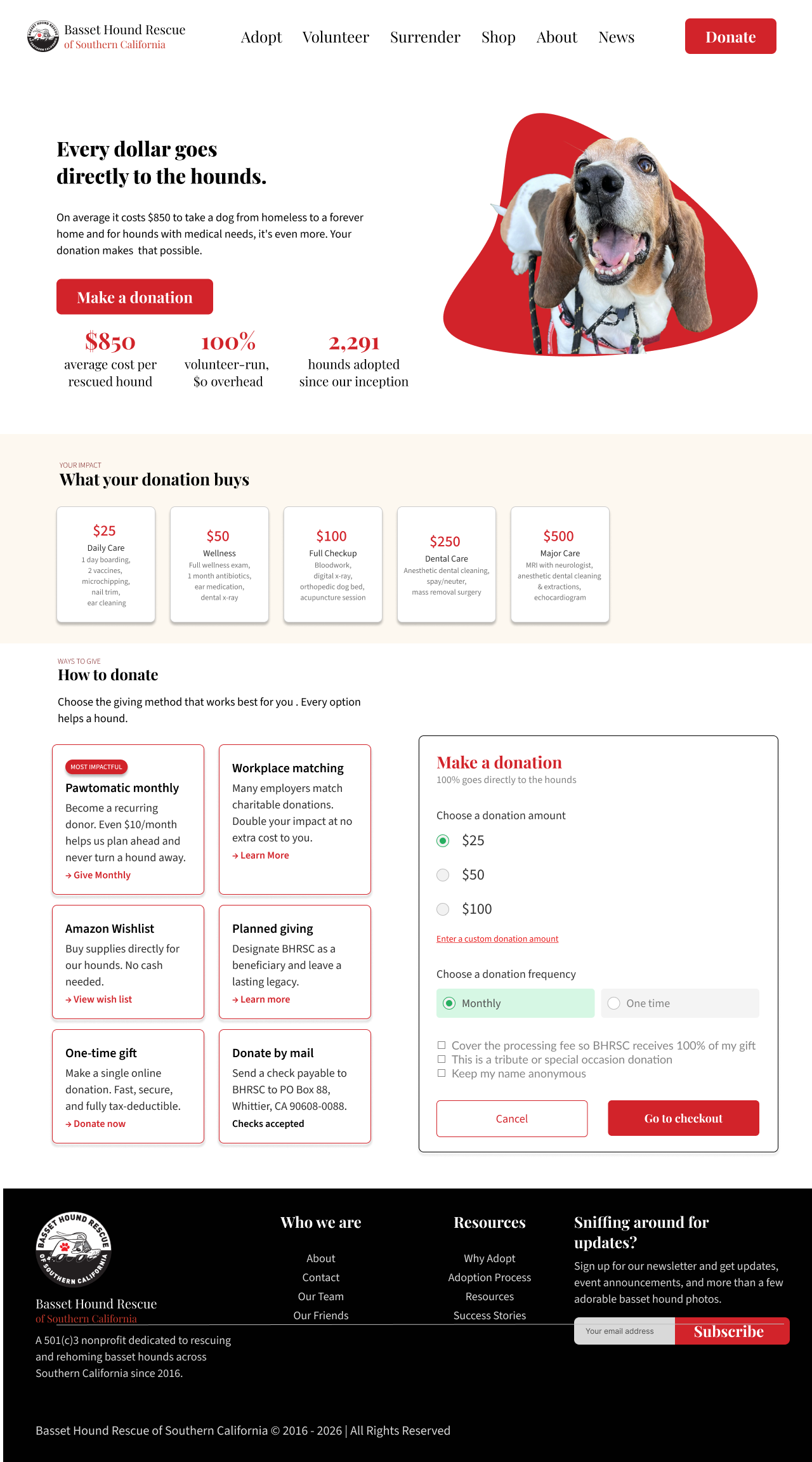
BHRSC Donate
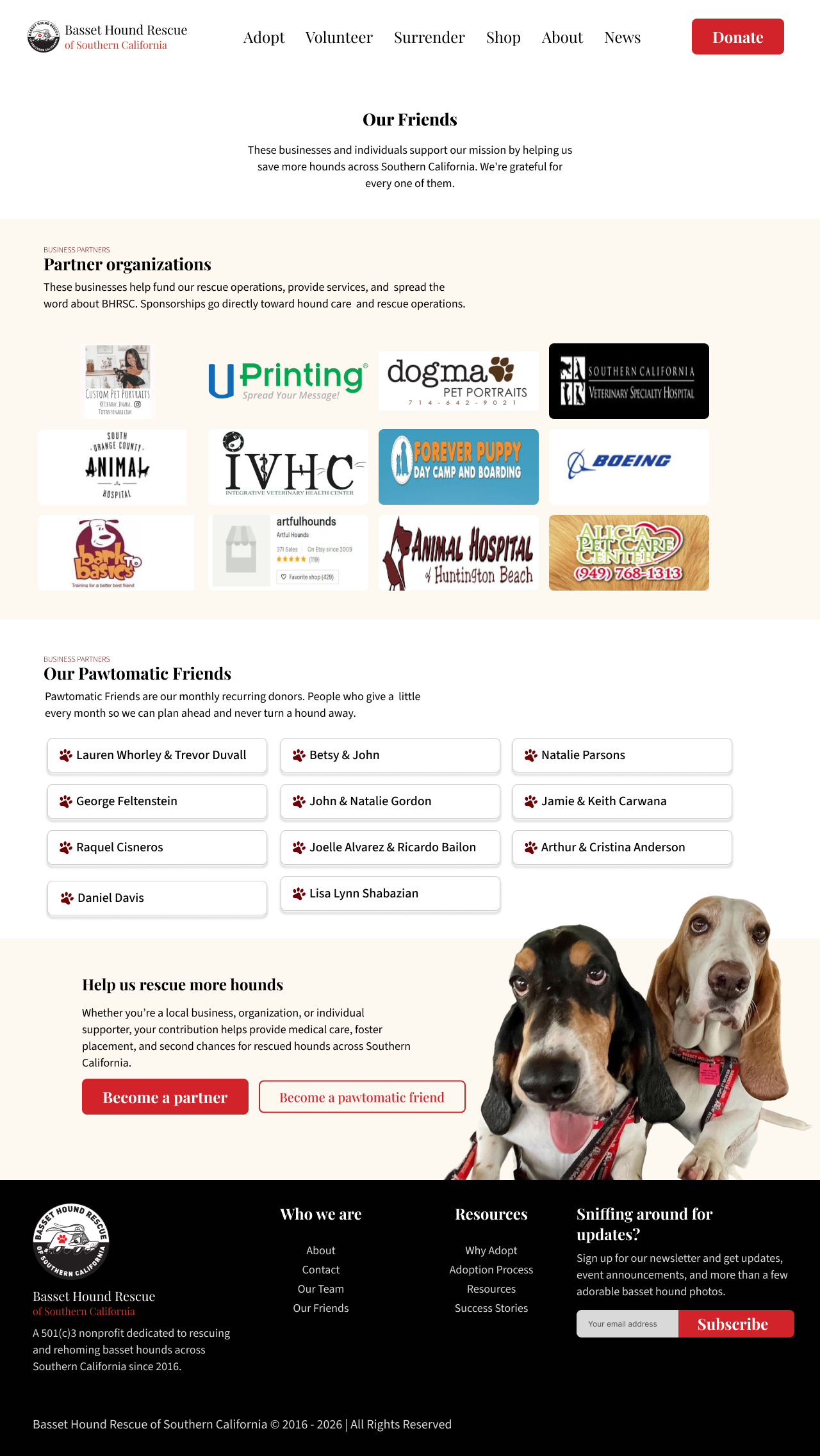
BHRSC Friends Page
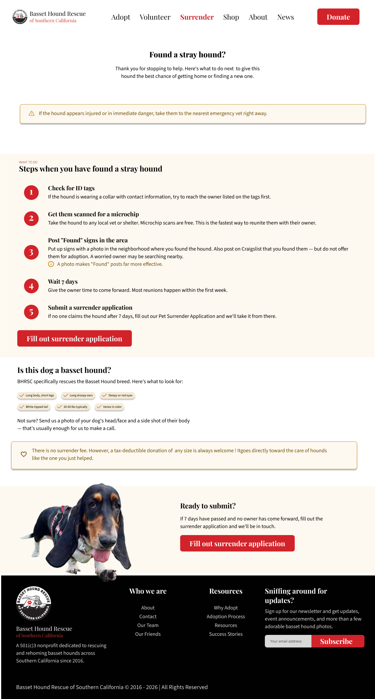
BHRSC Found Stray
Reflection
This project taught me a lot about designing within real constraints and working with non-technical stakeholders, navigating feedback, and balancing what's ideal with what's feasible. Leading the redesign gave me hands-on experience with the design process. It also reinforced how much of UX work is communication and translating goals into decisions that everyone on the team can understand and get behind.
Being the sole designer on this project also taught me how easy it is to lose perspective. Red is BHRSC brand color, so I leaned on it throughout the site, but I did not catch that in a few places, like error states and warning text, red was reading as something is wrong rather than as part of the brand identity. My webmaster and the other web dev assistant both flagged this when reviewing the mockups, and it was a good reminder that outside feedback catches things you stop seeing once you are deep in your own designs. I have since gone back to rethink where red should carry brand meaning versus where a different color is needed to avoid sending the wrong signal.